Who creates title sequence's - where do they get their ideas?
HISTORY
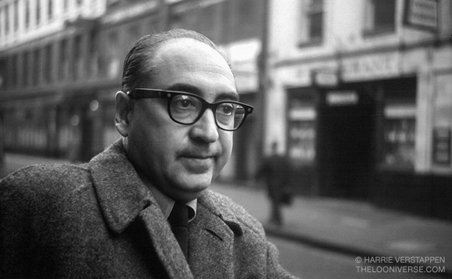
The likes of Saul Bass and Kyle Cooper have set the highest of movie title standards and as you'll see from this list, many graphic designers have clearly been influenced by them, while creating a new breed of iconic and culturally relevant movie title sequences of their own. Saul Bass was an American graphic designer and Academy Award winning filmmaker, best known for his design of motion picture title sequences. Bass became widely known in the film industry after creating the title sequence for Otto Preminger's The Man with the Golden Arm (1955). The subject of the film was a jazz musician's struggle to overcome his heroin addiction, a taboo subject in the mid-1950s. Bass decided to create an innovative title sequence to match the film's controversial subject. He chose the arm as the central image, as it is a strong image relating to heroin addiction. The titles featured an animated, white on black paper cut-out arm of a heroin addict. As he hoped, it caused quite a sensation. Bass once described his main goal for his title sequences as being to ‘’try to reach for a simple, visual phrase that tells you what the picture is all about and evokes the essence of the story”.
PRESENT
Box Trolls -
We were given a typeface designed by LAIKA’s Josh Holtsclaw. It was a challenge to track the type through scenes and maintain legibility. The solution was to make the tracking very simple and keep the motion linear, with words screened in the background.
There was sensitivity from the beginning about readability and giving equal weight to the credits visually. One thing my career has taught me is that the more you try to get fancy with elements, the harder everything is to balance. If the style of the artwork were simpler we could have pushed the text design further in terms of movement and layout, but it’s difficult to combine complex backgrounds with ornately treated text and not lose legibility or design integrity.


No comments:
Post a Comment